
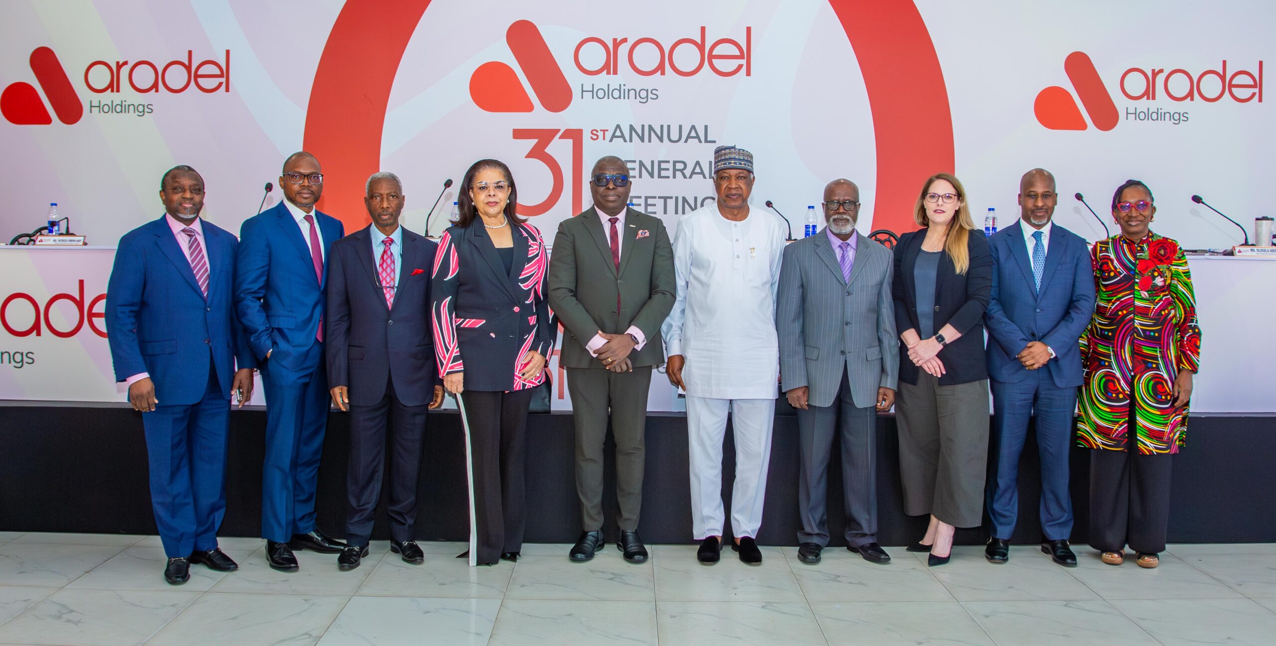
From NDEP to Aradel Holdings: rebranding a Nigerian energy company
Rebranding an established energy company is about more than introducing a new name or unveiling a new logo. It is about redefining how the business presents itself to the market, communicating its strategic direction, and building a brand that reflects where the company is headed.
When Nigerian energy company NDEP transitioned to Aradel Holdings, the ambition called for a comprehensive approach. Over ten months, we delivered a new brand identity, tagline, and brand guidelines, alongside a redesigned website, a 10-minute corporate documentary, a corporate photography library, and a sustained social media programme to support the transition.
But how do you bring all these elements together to create one consistent brand experience?
The BLU Newsletter — FREE
Get What’s Working in Marketing Right Now
WhatsApp funnels, AI search, the ad platforms outperforming everyone. Get the useful content before it’s obvious — from an agency in the middle of it across 5 countries.
Join thousands of marketers. Unsubscribe anytime.
In this case study, we take you behind the scenes of the Aradel Holdings rebrand, exploring the brief, our strategic and creative approach, the execution, and the results. We also share practical lessons for marketing leaders managing major brand transformations in Nigeria’s energy, financial services, and infrastructure sectors.
The strategic logic behind the name change
NDEP had spent years building operational credibility in Nigeria’s upstream oil and gas sector. The business had genuine achievements to its name. But the brief wasn’t to celebrate the past; it was to frame a future. The company was evolving its portfolio and sharpening its ambitions, and its existing identity couldn’t carry that story. The name itself had become a constraint.
Becoming Aradel Holdings required more than a new logo. It required the market (investors, partners, industry peers, employees) to understand why the change was happening and what it meant for the company’s direction. That’s a fundamentally different brief from a visual refresh. It’s a communications challenge that happens to involve design.
The scope we were handed reflected that reality: new name, logo, and tagline; a brand manual comprehensive enough to govern every downstream application; a complete website redesign; photography and video production; social media content creation and management. Each of those deliverables is consequential on its own. Running them all in parallel, against a single coherent strategic brief, is what made this a 10-month programme.
Why rebranding in Nigeria’s energy sector is particularly demanding
Nigeria’s energy sector operates under close institutional scrutiny. Investors, regulators, and the financial press track these moves carefully. A name change at the wrong moment, or communicated poorly, can create exactly the kind of uncertainty that damages shareholder confidence. The stakes are real.
For a company approaching a listing on the Nigerian Stock Exchange, that pressure is amplified. Institutional investors want to understand the narrative before they take a position. Analysts want clarity on what the brand change signals about the company’s direction. The financial media will frame the story the way they see fit unless you give them a better one.
There’s also the internal dimension. When a company changes its name, employees hear it first as a question about stability. Before any external communications go out, the people inside the business need to understand what’s changing, what isn’t, and what it means for them. Skip that step and you launch with a fragmented organisation behind you.
Research before design
The engagement started with stakeholder interviews across leadership and key employee groups, combined with a competitive analysis of Nigeria’s energy sector landscape. This wasn’t research for a report. It was research to close the gap between how NDEP was perceived and how Aradel needed to be understood.
From that foundation, we built the brand positioning: Aradel as a dynamic, future-ready energy company anchored on innovation, sustainability, and leadership in energy transformation. Getting the language right took iterations. The positioning had to work simultaneously for institutional investors, for employees on the ground, and for the broader market. Those three audiences don’t always respond to the same things.
Client collaboration was built into the process throughout. Every major milestone had a review and sign-off point with Aradel’s leadership. This kind of engagement only works if there’s genuine alignment at every stage, not a brief handed over at the start and a presentation delivered at the end.
The internal communications strategy
Before the public announcement, we developed a dedicated internal communications strategy to bring Aradel’s employees along. The objective was straightforward: by the time the market heard about the rebrand, the people inside the company should already understand it, believe in it, and be able to speak to it confidently.
This matters more than most organisations realise. Employees talk. When a company rebrands, industry contacts, journalists, and competitors often hear about it from inside first. If employees are confused or sceptical, that sentiment leaks out. If they’re genuinely bought in, that comes through too.
The outcome was visible at the shareholder level. The new name and logo received unanimous approval at an Extraordinary General Meeting. Unanimous votes on a rebrand don’t happen by accident. They happen when the communications work has been done properly, well in advance, and the groundwork is solid before anyone raises a hand.
The creative execution
With positioning confirmed and internal alignment in place, the creative work moved with purpose. A new logo and colour palette, developed to carry Aradel’s positioning into every visual context from corporate documents to digital profiles. A brand manual comprehensive enough to govern applications across multiple geographies and formats. Without that documentation, the visual consistency you build at launch degrades within months as different teams make different calls.
The website redesign focused on user experience and Aradel’s project portfolio. An energy company’s website is a due diligence document as much as it’s a marketing tool: investors and partners land there specifically to understand what the company does and what it has delivered. The redesigned site was built to answer those questions clearly, not to showcase design for its own sake.
Photography and video production ran in parallel with the brand design work, producing a library of assets ready for deployment across the launch and the months that followed. This kind of preparation is what separates a launch that sustains its momentum from one that peaks on day one and then goes quiet.
The documentary
The centrepiece of the content programme was a 10-minute documentary capturing Aradel’s legacy of innovation. This is worth dwelling on, because the instinct for a rebrand launch is usually to go promotional, to lead with the new identity and tell the market how to feel about it. That rarely works with a stakeholder and investor audience.
What actually works is narrative. Showing where the company has been, what it has built, and why the next chapter follows logically from everything before it. That’s what the documentary did. And the result was over 20,000 views within the first month. Strong engagement for content explicitly targeted at investors and industry stakeholders rather than a consumer audience.
Digital launch and social media
The social media brief ran from pre-launch preparation through to the ongoing management of Aradel’s profiles after the rebrand went live. This included content creation aligned to the new brand positioning, engagement management, and performance tracking against agreed KPIs.
LinkedIn was the primary platform for reaching the investor and professional audience Aradel needed to engage. Within the first three weeks of the launch, the revamped LinkedIn presence delivered 942 new followers and 45,257 organic impressions. That’s meaningful traction for an organic programme in a sector that doesn’t typically generate high social engagement.
Overall engagement on digital platforms increased by over 40% across the rebrand period. The revamped website saw a 35% increase in traffic within the first quarter. These aren’t vanity metrics. For a company preparing a market listing, digital visibility and stakeholder engagement directly support the case that the organisation is active, credible, and generating interest.
What this tells you about large-scale rebranding briefs
A few things from this engagement are directly relevant if you’re a marketing leader navigating something similar in Nigeria’s corporate sector.
Sequence matters more than speed. The 10-month timeline existed because each phase needed to be completed before the next one could work. Rushing to a launch date before internal alignment is solid, or before the brand documentation is comprehensive, creates problems that take longer to fix than the time you saved.
The brief needs to be bigger than the logo. Every organisation that’s handled a rebrand and been disappointed by the results treated it primarily as a visual exercise. The visual work is the most visible part, but it’s not where the value is created. Value comes from the positioning clarity, the stakeholder alignment, and the communications strategy that surrounds the creative.
Documentation is what makes a rebrand last. A brand manual that governs every downstream application (from investor presentations to social media profiles to site signage) isn’t a deliverable for the files. It’s the mechanism that keeps the rebrand coherent over time as different teams, agencies, and individuals make decisions about how to represent the brand.
The NGX rebrand, covered in our NGX rebrand case study, presented a similar challenge: repositioning an institutional Nigerian brand at scale for a market that already had strong existing associations with it. The briefs were different in scope, but the underlying strategic challenge was comparable. In both cases, the work that created the most durable value happened before the first design file was opened.
If you’re approaching a moment like this (an acquisition, a listing, a strategic pivot, a name change that needs to land correctly with investors and the market), the question worth starting with is: how do we control how the market understands our next chapter? See how we work with established Nigerian businesses on briefs like this at our brand identity and design service page, or read more about choosing a B2B marketing agency in Nigeria that can run a programme of this scope.
Start the conversation about your brief
BLU Flamingo works with established Nigerian businesses navigating brand transitions at scale: energy companies, financial institutions, listed and listing-stage organisations, and companies preparing for a new strategic chapter. Our work spans brand strategy, identity design, digital execution, and corporate communications, integrated under one team and one brief.
View the full Aradel Holdings case study at bluflamingo.net/case-study/ng/ndep-rebrand and explore how we work with Nigerian brands. When you’re ready to talk through what a programme like this would involve for your organisation, get in touch with our team and we’ll take it from there.